Jan 2024 Update
(Please note that a good part of this dev log was written in December and may sound a little strange as some things I posted near the top got done by the time you read to the bottom. Most of my dev logs are written 'day by day' in a chronological fashion, and because I had time off in December I had more time to do game dev than usual)

When I changed the main image on itch to a modified version of the title splash I realized that the backing part of the frame that had the title text was very difficult to read at lower resolutions due to the dark color I chose. So I changed the color to a white with a very slight blue tint to it. I’m hoping it will make the text a bit more readable. I updated the title screen splash with this version too. I’ll hold off on updating the main image on itch as I may revise the image again before next release. (Note:later in this log I updated the splash again to have flavored text)
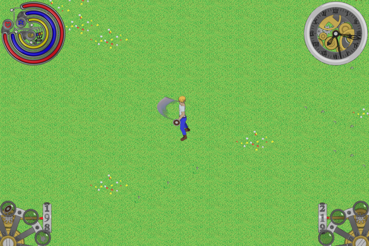
I didn’t have any motivation to program as of yet, so I went back to artwork. One of the problems I needed to tackle was the character customization. For the most part it will just be a simple color swap. Originally I wanted to just have unique textures for each of the color swaps as it would open the door for more elaborate customization's, but I quickly realized that this would bloat the amount of memory needed for the main character controller.
My solution to this problem is to add a separate layer to isolate the line-art and use modulate to change the characters color. This will only add one extra layer to the character controller as I don’t want to modulate the line-art along with the skin and hair color. Since I need(want) to redo the MC sprites anyway, this is a good opportunity to implement this at the same time.
Working on optimizing and reprinting the MC animations I was beginning to notice that some of the animations were getting kind of choppy. Most noticeably on the walk cycle. I may add a couple of tween frames later on, but I want to see how much memory all the stuff I want to implement is going to take. I could reduce the resolution of the images to produce the same memory savings, but I would prefer not to do that as I like sprites that scale well with big screens.
After replacing all the frames that were already in the game, I saved nearly a gigabyte of ram. This is even with adding a new layer to handle the line-art.

And after adding in all the tool animations I added that gig of ram right back again….. I’ll have to spend a couple of days just cropping frames, I actually have an idea how to make it more efficient and will try it out later.
My head was swimming after spending the bulk of Christmas and New Years break just to configure all the new animations for the tools (This was also around the time I got approved as a Steam partner, so I was also working on thumbnails and banners too).

The title splash got a tweak too as I noticed a lot of games on steam had some kind of illustrated/flavored text. It didn’t turn out too bad, but I realized that having such a long title made it difficult to make it fit in a small image. I’ll have to rely on the game art to catch peoples attention I guess.
I wanted to get back to programming, so I settled on something that I knew would be a relatively easy to do but somewhat time consuming, the item and equip select wheels were in my sights.

The wheels that I had in the game all this time were not of any use as the animations were printed in a convoluted manor and used more frames than I needed So I went back to my blend files and re animated them.

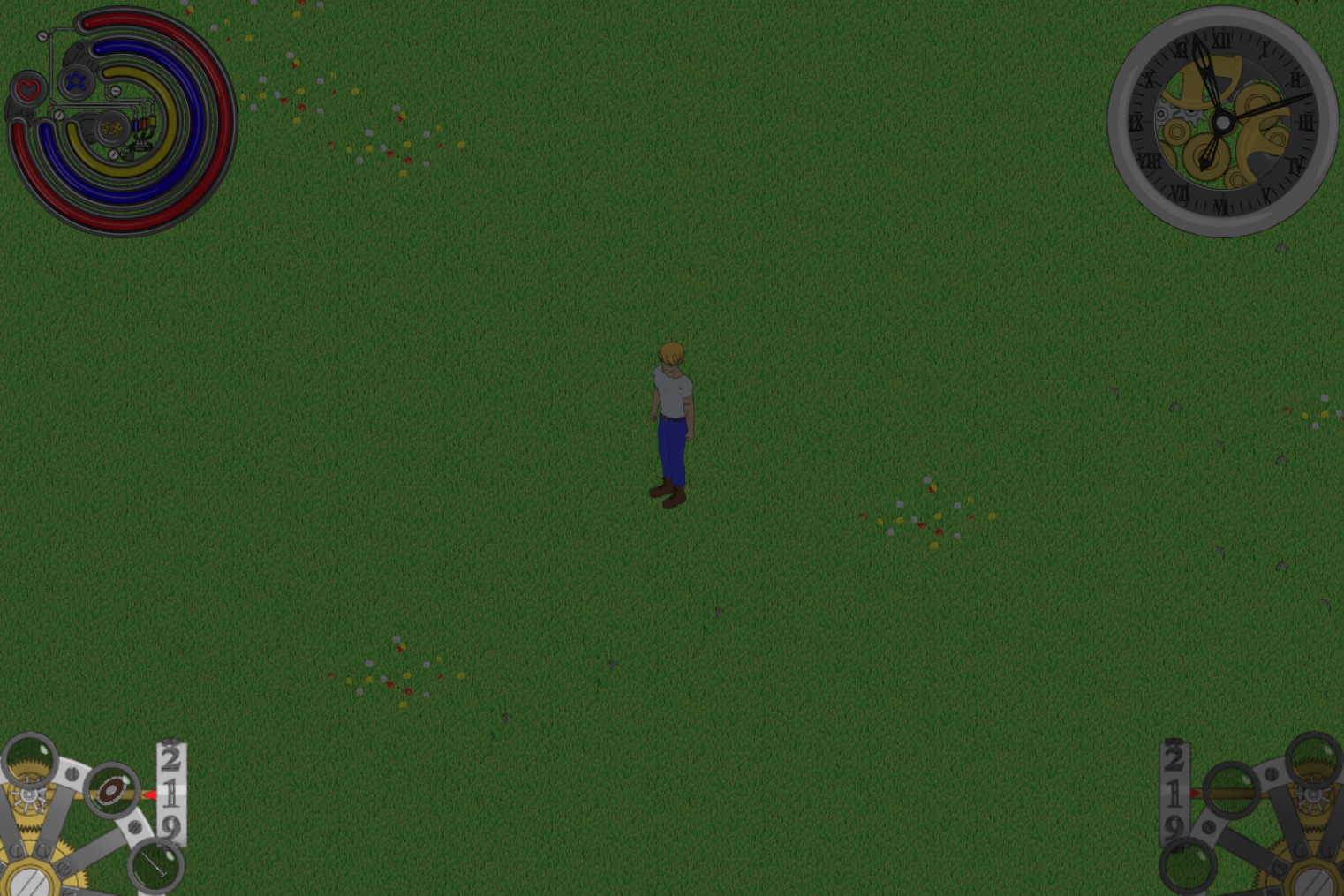
After making the new animations and making a state machine so the player can access them with the L2 and R2, I also added some sprites to the wheel so I can dynamically put icons in each slot. It was getting late so I went back into the clock script to give myself more control how the time passed just to kill a couple of hours.

The following days I didn’t feel like doing lengthy coding that I could easily screw up if I were tired (it’s snowing here now so I have to shovel regularly), so I started cropping frames. I’ve saved about 0.20Gbi so far, and I’m only on my first layer. I’ll continue to do this on the week days, as it’s a very lengthily and tedious, but linear process that can be done while half asleep. (I backed up the original frames just in case)
A few days later my store page got rejected on Steam because of the thumbnails/banners being too spicy, the title not being visible enough on one of the smaller images and the reviewer wasn’t happy with one of my early access answers (for a free game, seriously). As for the artwork in the thumbnails, I guess the nude side view of the wolf girl (covering up all the genitals and nipples) was too hot for Steam (pun intended). So I spent the better part of that days morning making edits. Apparently if you mark your game as adult only, your thumbnails will still be seen by general audiences…. I probably should give Valve a break as I imagine they are under constant attack by Twatter morons and the fire & brimstone kind of characters…. Anyway, I’m not going to sweat over this. I’ve decided to wait now until I have a proper Early Access build before submitting the changes I made, as they want to review one of my builds before even posting the storefront. (I'll likely be uploading to itch first anyway, so no worries about delays if you want to play the latest build right away)
With that all said I’ve set my development goal and defined what my full game loop is:
-Day night cycle implemented as well as end of day
--NOTE: I may hold off on adding constraints like stamina for the time being
-Crops to farm
-Barn for monster girls
-Some low tier resources to gather
-A temp shop (ran by yours truly)
-Make at least the Equip wheel functional
-Hook up the tool use animations so the player can finally use a pick axe (Fuck, I just realized I forgot make animations/icons for the regular axe)
--Tools include hoe, pick, seeds, water can(An axe and scythe will be added eventually)
-Monsters, animals and monster girls will be added to another area called the Planes. (Will be a new tileset)
--Players will encounter beginner level stuff in this area.
-The ability to capture monster girls.
I’m sure I’m forgetting stuff to mark down, but this should give you a good idea as to where I’m going with this.
I continued work on the equip wheel. I printed off drop animations and Icons for the inventory as it will be necessary to have these tools in the inventory at some point. I also needed a system to switch the animations for whatever tool the player has equipped so I got that done before getting to the rest of the equip system.
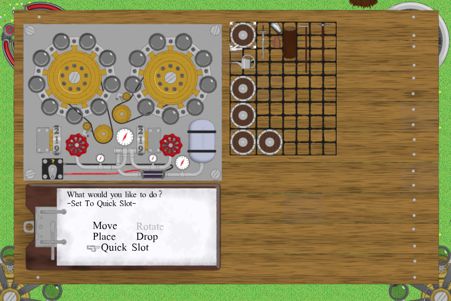
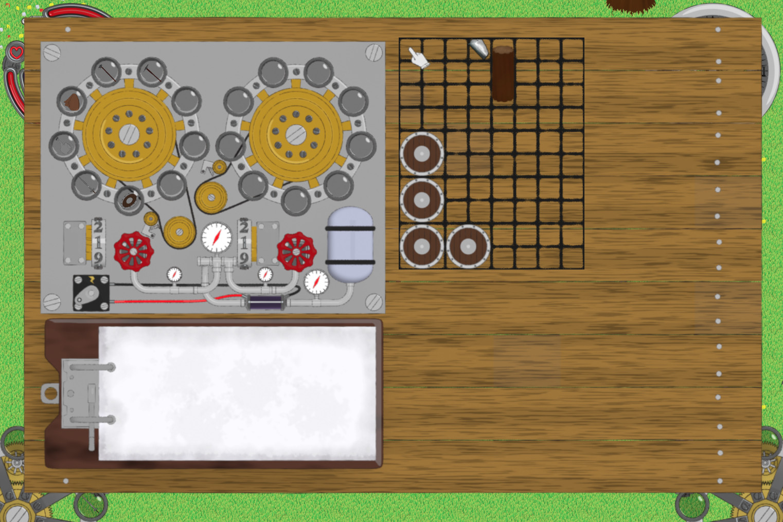
The equip wheels in the inventory were next on the list. These wheels will be used to load the quick slot wheels on the HUD from the inventory screen. I had to reprint them because I didn’t render them with linear interpolation, which causes some eyesore when reversing the animations. I also chopped off a couple of frames per animation strip for the sake of saving more memory.
It took me two days of coding, but I finally hooked up all the code to switch between the various tools. The player can now insert equipment into the equipment wheel and equip it by holding down Y or the L2 trigger then pressing the Interaction button or key. The Cancel button or key will unequip everything the player has equipped. This can be done dynamically as I intend to have the player swap tools and weapons on the fly. I still need to put logic into the Item wheel, but will hold off on that for now as I have no items (like potions) that can be used in that fashion as of yet.
Anyway, that’s it for now.
Get I Couldn’t Become A Farmer, So I Decided To Capture And Breed Monster Girls Instead.
I Couldn’t Become A Farmer, So I Decided To Capture And Breed Monster Girls Instead.
More posts
- The Overreach of Payment Processors and the Future of NSFW Games v2.005 days ago
- A Look Back on 2024 and Happy Holidays.Dec 22, 2024
- Godot and the Crazy Green Haired Power TripperOct 07, 2024
- v0.25 (And an Important Announcement)Jun 21, 2024
- May 2024 UpdateMay 26, 2024
- April 2024 UpdateApr 27, 2024
- The Overreach of Payment Processors and the Future of NSFW Content.Apr 07, 2024
- Mar 2024 UpdateMar 31, 2024
- Feb 2024 UpdateFeb 24, 2024
Leave a comment
Log in with itch.io to leave a comment.